

一、Tabs
1、概述
我们经常使用时,会出现试图切换的场景,比如底部有多个菜单,“首页”、 “我的”等。
两个内容容器的切换:
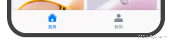
ArkUI开发框架提供了一种页签容器组件Tabs,开发者通过Tabs组件可以很容易的实现内容视图的切换。页签容器Tabs的形式多种多样,不同的页面设计页签不一样,可以把页签设置在底部、顶部或者侧边。
二、Tabs组件的使用
Tabs组件仅可包含子组件TabContent,每一个页签对应一个内容视图即TabContent组件。
示例代码:
@Entry
@Component
struct ControlTabs {// 设置Tabs控制器private controller: TabsController = new TabsController()build() {Row() {Column() {Tabs({ barPosition: BarPosition.Start, controller: this.controller }) {TabContent(){Column().width('100%').height('100%').backgroundColor(Color.Red)}.tabBar("Red")TabContent(){Column().width('100%').height('100%').backgroundColor(Color.Green)}.tabBar("Green")}.barWidth('100%') // 设置TabBar宽度.barHeight(60) // 设置TabBar高度.width('100%') // 设置Tabs组件宽度.height('100%') // 设置Tabs组件高度.backgroundColor(0xF5F5F5) // 设置Tabs组件背景颜色}.width('100%')}.height('100%')}
}
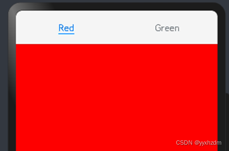
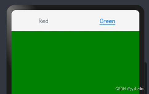
效果图:
接口:
Tabs(value?: {barPosition?: BarPosition, index?: number, controller?: TabsController})
参数:
| 参数名 | 参数类型 | 必填 | 参数描述 |
| barPosition | BarPosition | 否 | 设置Tabs的页签位置,默认值:BarPosition.Start(顶部) |
| index | number | 否 | 设置初始页签索引。 默认值:0 说明: 设置为小于0的值时按默认值显示。 可选值为[0, TabContent子节点数量-1]。 设置不同值时,默认生效切换动效,可以设置animationDuration为0关闭动画。 |
| controller | TabsController | 否 | 设置Tabs的控制器 一搬是: new TabsController(); |
BarPosition枚举说明:
| 名称 | 描述 |
| Start | Vertical属性方法设置为true时,页签位于容器的左侧;Vertical属性方法设置为false(默认)时,页签位于容器顶部。 |
| End | Vertical属性方法设置为true时,页签位于容器右侧;Vertical属性方法设置为false(默认)时,页签位于容器底部。 |
Tabs的一些属性:
| 名称 | 参数类型 | 描述 |
| Vertical | boolean | 设置为false时为横向Tabs 设置为true时为纵向Tabs。 默认值:false |
| scrollable | boolean | 设置为true时,可以通过滑动页面进行页面的切换。 设置为false时,不可滑动来切换页面。 默认值:true |
| barMode | BarMode | TabBar布局模式,具体描述见TabBar布局模式。 默认值:BarMode.Fixed |
| barwidth | number | Length8+ | TabBar的宽度值。 说明: 设置为小于0或大于Tabs宽度值时,按默认值显示。 |
| barHeight | number | Length8+ | TabBar的高度值。 说明: 设置为小于0或大于Tabs宽度值时,按默认值显示。 |
| animationDuration | number | TabContent滑动动画时长。不设置时,点击切换页签无动画,滑动切换有动画;设置时,点击切换和滑动切换都有动画。 默认值:300 说明: 设置为小于0或百分比时,按默认值显示。 |
设置TabBar布局模式:
Tabs的布局模式默认是Fixed的,所以Tabs的页签是不可滑动的。当页签比较多的时候,可能会导致页签显示不全,将布局模式设置为Scrollable的话,可以实现页签的滚动。
Tabs的布局模式有Fixed(默认)和Scrollable两种:
- BarMode.Fixed:所有TabBar平均分配barWidth宽度(纵向时平均分配barHeight高度),页签不可滚动,效果图如下:

- BarMode.Scrollable:每一个TabBar均使用实际布局宽度,超过总长度(横向Tabs的barWidth,纵向Tabs的barHeight)后可滑动。

自定义TabBar样式
TabBar的默认显示效果如下所示:

往往开发过程中,UX给我们的设计效果可能并不是这样的,比如下面的这种底部页签效果:

TabContent的tabBar属性除了支持string类型,还支持使用@Builder装饰器修饰的函数。您可以使用@Builder装饰器,构造一个生成自定义TabBar样式的函数,实现上面的底部页签效果,示例代码如下:
@Entry
@Component
struct TabsExample {@State currentIndex: number = 0;private tabsController: TabsController = new TabsController();@Builder TabBuilder(title: string, targetIndex: number, selectedImg: Resource, normalImg: Resource) {Column() {Image(this.currentIndex === targetIndex ? selectedImg : normalImg).size({ width: 25, height: 25 })Text(title).fontColor(this.currentIndex === targetIndex ? '#1698CE' : '#6B6B6B')}.width('100%').height(50).justifyContent(FlexAlign.Center).onClick(() => {this.currentIndex = targetIndex;this.tabsController.changeIndex(this.currentIndex);})}build() {Tabs({ barPosition: BarPosition.End, controller: this.tabsController }) {TabContent() {Column().width('100%').height('100%').backgroundColor('#00CB87')}.tabBar(this.TabBuilder('首页', 0, $r('app.media.home_selected'), $r('app.media.home_normal')))TabContent() {Column().width('100%').height('100%').backgroundColor('#007DFF')}.tabBar(this.TabBuilder('我的', 1, $r('app.media.mine_selected'), $r('app.media.mine_normal')))}.barWidth('100%').barHeight(50).onChange((index: number) => {this.currentIndex = index;})}
}
代码中将barPosition的值设置为BarPosition.End,使页签显示在底部。使用@Builder修饰TabBuilder函数,生成由Image和Text组成的页签。同时也给Tabs组件设置了TabsController控制器,当点击某个页签时,调用changeIndex方法进行页签内容切换。
最后还需要给Tabs添加onChange事件,Tab页签切换后触发该事件,这样当我们左右滑动内容视图的时候,页签样式也会跟着改变。